
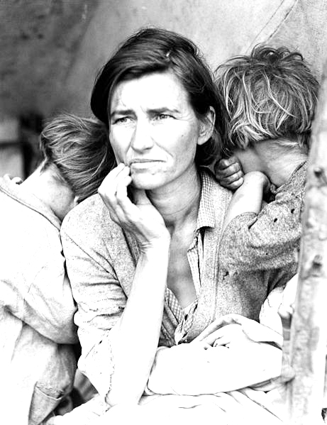
Migrant Mother, Dorothea Lange, 1936. Silver gelatin print.
This photograph was commissioned by the Farm Security Administration (FSA). Florence Owens Thompson looks towards the future with worry, as her children bury their heads into her shoulders. The FSA was part of The New Deal, a set of programs initiated by Franklin Delano Roosevelt to stimulate and revitalize weak economies from 1933 – 1938. The FSA hired photographers, such as Lange, Walker Evans and Marion Post Wolcott to document America after the Great Depression. Notice how the range of tonal values expresses the details in Florence’s face and the blanket on her lap.
When evaluating photographic images, in color or grayscale, the range of tones should be taken into consideration. The tonal scale in an image encompasses the changes in value from black to white. Unless the aim of the image-maker is to produce a low key (dramatically dark) or high key (exceptionally light) image, the file and resulting print should include image details in the shadow and highlight areas.
Common problems that are addressed by adjusting the tonal scale are as follows:
TOO HOT
The image is too hot when the white areas are “blown out”, or there are no image details in the highlights.
NO SHADOW DETAIL
The shadow area of the image is too dark or there are no image details in the shadows.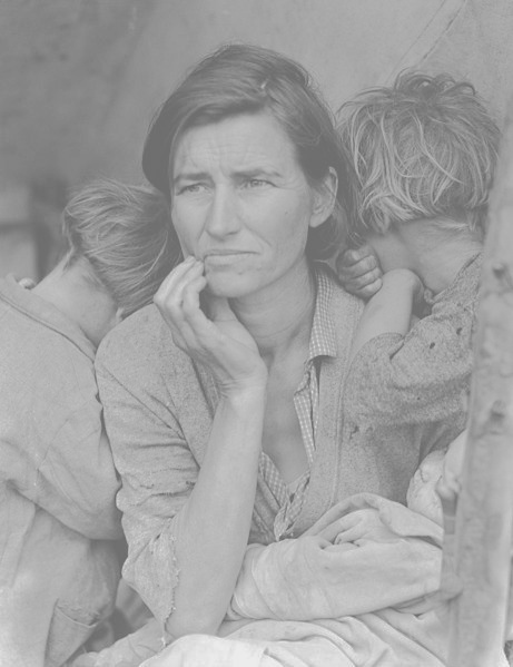
MURKY
The image is murky when there is not enough contrast between the darkest black value and the lightest white value.
COLOR CAST
The image displays a colorcast when there is evidence of a hue in areas that should be neutral gray or white.


Download this file. Control Click
Resample Image and Image Size
GO to : File > Image Size:


Notice the button for ‘Resample Image’ is not checked in the Image Size dialog box on the left. In the Image Size dialog box on the right, where the resolution value was changed to 936 dpi, the width and height that the image will be when it is printed is reduced to 4 by 6 inches and the amount of pixels (in the top part of the box) remains the same. If you check the ‘Resample Image’ box then the amount of pixels (in the top part of the box) will change. Scaling an image up always makes the image more blurry because Photoshop guesses what pixels to add.
Once you scale an image down you lose pixels and cannot get them back if you decide to scale back up. For this reason it is always better to work with a large file size and then scale your images down to make the final image if need be. Or you can save a large copy of the file in case you need to go back to the original size.
Understanding the histogram
Now we will take a look at the tonal range within the image. This can be done in any color mode, but for the purpose of keeping this process easy for the first time, we’ll change the image to grayscale color mode.
1. Click on Image > Mode > Grayscale to convert the image from RGB color mode to Grayscale. (Click OK through the “Discard Color Information” dialog box.) Save the file as flower_gray.psd.
2. Click Window > Histogram.
The next part of this exercise is to be observant about the value of the light and dark tones in your image. We do this with the use of the Histogram palette.
This palette conveys information about the grayscale tones in the document. This is true regardless of whether the document is in color or grayscale, as color images are rendered digitally by compositing separate color channels (red, green, and blue, for example), each with corresponding grayscale values. So once again, the Histogram displays information about grayscale values, even if they correspond to color information. Here’s the quick version of how to read a histogram:
The overall graph displays the amount information within the image (y-axis) at the various levels of gray from black (on the left side of the x-axis) to white (the right side of the x-axis). There are 255 levels of gray in any 8-bit image. Consumer scanners and digital cameras capture 8-bit images. There are professional scanners and cameras that capture 16-bit images, yielding more options for adjusting the tonal range; but for the beginning digital media student, we will remain focused on 8-bit images. Look at the histogram to make the following observations:
A. Does the histogram start and end at the beginning (dark values) and end (light values) of the x-axis? This would mean that there actually exists image information in the darkest shadow areas and the lightest highlight areas. If the graph seems to end before the edges of the box containing the histogram, the graph is “clipped” and there is no information at one (or both) end(s) of the spectrum. There is probably a noticeable lack of contrast in the image if the graph is clipped.

Notice the histogram for this image is clipped on the shadow side.
B. Where on the x-axis of the graph is most of the image information stored? In other words, where are the spikes in the graph? This should make sense in terms of how dark or light the overall image appears.
Imagine in the image above of the histogram that the midway point is where 50% gray occurs in the image. In this image the highest spike appears somewhere between the blackest shadow and 50% gray.
| Tip: The triangle-in-the-exclamation-point icon in PhotoShop usually means “out of gamut,” but in the histogram it is meant to indicate that the palette is showing cached information. Clicking on the icon will refresh the palette information. In this exercise we are not changing anything, so it is not important. |
C. Does the histogram have any gaps where information does not exist? This means that there is no image information in areas where gray values between black and white are expected. This is usually a result of “over-tweaking” an image with tonal adjustments, as opposed to something that will be noticeable from a scan or digital camera capture. Sometimes this is a reasonable result of increasing contrast in an image, especially when certain areas are particularly hot (bright or blown out highlights).
In this image, the histogram has no gaps. In the next exercise we will be making changes to the histogram and you will see gaps as a result.
Adjusting the histogram in Levels or Curves
1. Click Image > Adjustments > Levels, which is used to control tonal adjustments specifically in the shadow and highlight areas. The Levels dialog box displays the histogram that we just viewed in the previous exercise. At the left side, tonal information is presented for shadow areas, then mid-tones, followed by highlights on the right side. Moving the input level sliders (the small triangles just beneath the graph) to correspond to image areas where there is information on the left and right sides of the histogram readjusts where 100% black and 100% white occur within the image. Tonal manipulations occur as a result of adjusting the numbers associated with each slider. If the objective is to make the image look abstract through high contrast, push the sliders towards each other. If the objective is to make the image seem true to life, the sliders should be used carefully. Adjust the sliders to your taste and click OK.

2. Re-open “Fig08_rgbimage_CS6.psd) for this step so it is RGB. Look at the Histogram palette to see information about the grayscale values in the image.
3. From the upper right pull-down menu in the Histogram palette, choose “All Channels View” to see the histogram for the composite RGB channel as well as the single red, green and blue channels that comprise the image. Even though the image is seen in color, the overall scale of gray values should be evaluated. Notice the graphs in the Histogram palette for each of the three separate channels (ask the same questions as we posed when evaluating a grayscale image in exercise two).


Look at the individual histograms for the red, green, and blue channels. Notice that there is more highlight information in the red channel, while all three channels peak around the same point in the shadow areas. Also notice that the red channel has the most color information across the x-axis while the other two channels have steeper slopes towards the start and ending points of the curves.
4. Click Image > Adjustments > Curves. Once again, the histogram is presented in the Curves dialog box. Curves, like Levels, can be used to adjust the tonal scale within the image.
5. This time, don’t touch the RGB composite histogram. Instead, adjust each of the red, green, and blue graphs so that there is image information where the deepest shadows and lightest highlights appear. To do this, start by using the pull-down Channel menu from within the Curves dialog box to select “Red” (CMD+1). Use the input sliders on the left and right sides to move the edges of the endpoints of the line graph to the point where image information exists.


6. Use the pull-down Channel menu to select “Green” (CMD-2). Use the input sliders on the left and right sides to move the edges of the endpoints of the line graph to the point where image information exists.

7. Use the pull-down Channel menu to select “Blue” (CMD-3). Use the input sliders on the left and right sides to move the edges of the endpoints of the line graph to the point where image information exists.

8. Click OK. Adjusting the Curves (or Levels, either palette could have been used for this last exercise) manually for each color channel produces a better result than simply doing this one time for the composite RGB channel.
9. Notice the Histogram. It should show a graph with information that spans from the left side of the x-axis (shadows) to the right side (highlights).


The image on the left is before the curves were altered and the image on the right has been modified. Information spans the entire x-axis on the histogram. Notice that the contrast is slightly modified, but the overall change to the image is slight. Be careful about pushing the sliders too far. The modifications should be minimal.
Targeting saturation levels
Image > Adjustments > Hue/Saturation can be used to increase or decrease the saturation of specific hues within the image. This palette is often used to make a dominant color appear more vibrant within an image, but it is hard to notice if the image is not being viewed at 100 percent. Even then, sometimes it is easier to see the results of this image adjustment in the final print. If you are using the file included on the disk, the following details are the adjustments that we made on the file to demonstrate this concept.
1. Click Image > Adjustments > Hue/Saturation. Use the pull-down palette on the word, “Master,” to work specifically on the magenta areas of the image.

2. Use the Saturation and Lightness sliders to modify the image. The image below demonstrates our settings, but remember that our monitors may be calibrated differently. It is best to eyeball these numbers, rather than follow our specific settings. Remember, be sure the image is showing at 100 percent (use the Zoom Tool to zoom in or out) before making any adjustments.

